MedicAid
UI/UX


Problem
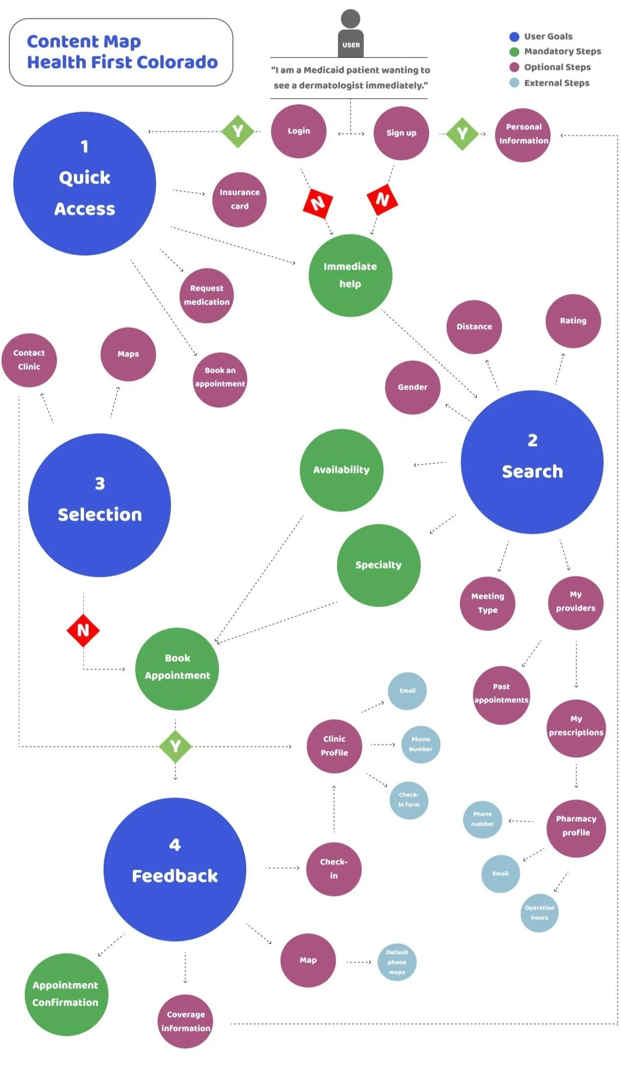
Colorado Medicaid users utilize an application named Health First Colorado. The app exists as a tool to help Medicaid users access their documents, renew their forms, and find care. However, the application is very unsuccessful.
The brand identity is not only boring but it is not accessible. The structure of the application is not user-friendly and not intuitive at all.
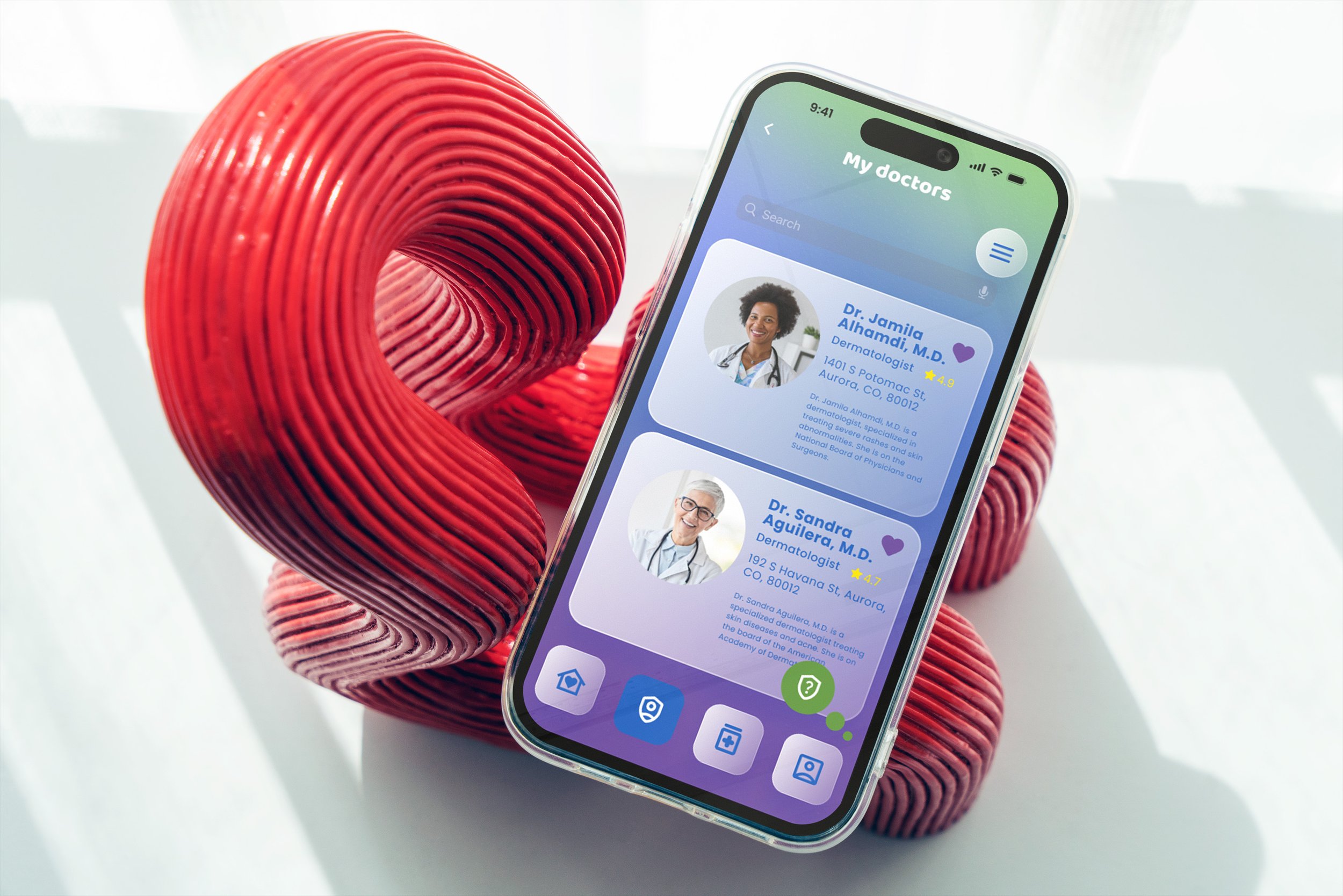
The Health First Colorado application demonstrates problems with its design, structure, and navigation. I designed a rebrand of the application and named it MedicAid, while redesigning the brand and screens.

Sketches & Mind Mapping
My goal was to simplify the application, as a whole. As a previous application user, I noticed how frustrated I became every time I used it. The information provided on the screens are very repetitive, and in some cases are unnecessary. It is also very hard to look up doctors near me; either the results would never load or the ones shown would not match the filters I put.
I envisioned a more user friendly interface, with a more vibrant feel. My intention was to make the most simple version of this application; one that required the least amount of effort from the user.
I started off by sketching some rough wireframes. I added in an AI generated assistant to serve as a helpful tool.
Color Palette & Brand Identity
#2F5DA0
#62428F
#5E8E3E
#FFFFFF
